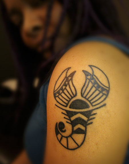
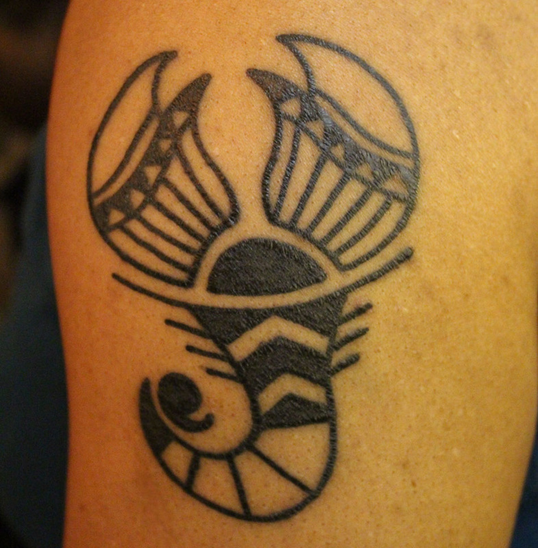
 Nigerian Igbo Tribal Style Tattoo Design The Backstory So I got an email out of the blue from Adrian at Studio 73 in Brixton saying that a customer had walked in claiming to have got a tattoo of one of his artists work on her neck and he thought it might be one of mine. To my amazement he was right! This lady had a lioness which I'd drawn several years ago prominently (and permanently) inked on her neck. Admittedly, it was never intended for this purpose so I was in two minds as to whether or not I liked it. Was I proud or just plain flattered? Anyway, the following week I mentioned this to a friend (Tracey) who confided that she was seriously considering getting inked herself (after many years toying with the idea). "Want me to design it for you?" I joked. "Yeah alright" she replied, deadly serious. The Brief Tracey wanted a scorpion on her upper arm to represent her star sign. A little nervous about permanently marking one of my best friends with something crap, I took the challenge very seriously. I did some research and opted to go down the tribal route. Inspired by her Nigerian / Igbo heritage, I put together some initial ideas and we had our first meeting. First drafts were given an initial nod, but a little refining was needed to make it perfect for a lifetime's wear. I took into account the fact that she was worried about the pain, and didn't want all the areas to be filled in. It was also going to be a small tattoo so needed to be bold enough to look good at a reduced size, and to show up well on her skin tone. Igbo design elements of water & strength were also incorporated into the claws & body of the scorpion. The final design was presented and she was thrilled. Knowing that I'd never designed a tattoo before, I was pleased that she was going to get it checked by a pro. Enter Chris Hewish at "The Family Business" in swanky London Town. The Tattoo
3 Comments
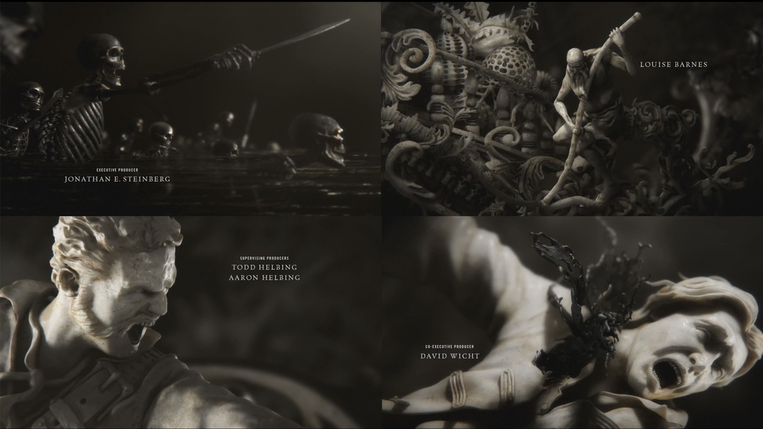
The evocative opening sequence of the STARZ Production "Black Sails" is my new inspiration. Markedly more sophisticated than the series it introduces, it stands alone as a beautifully crafted piece of design.
The series (a dark, violent prequel to Louis Stevenson's "Treasure Island') is set on New Providence Island in the early 1700's. Centring around Captain Flint and rival gangs of pirates, its brutal battles and fight scenes are introduced with finesse in these all important 90 seconds. Now don't get me wrong, I am absolutely hooked on Black Sails. Its dark humour, bloody violence and rogue characters keep me watching week after week, but it's the title sequence I look forward to almost more than the show. Designed by New York's "Imaginary Forces", and heavily inspired by the intricate sculptures of Kris Kuksi, the opening sequence pans gently over baroque style figurines. Dimly lit like an 18th century tavern at dusk, the soft lighting picks out contorted alabaster faces and blindfolded doomed souls sinking into the locker. 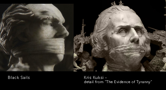
Now here's my dilemma. Before I had done any research I would have declared the sculptures in the opening sequence as works of tiny intricate genius. Figures writhing as if centuries old, they had come to life and were about to embark upon a dangerous adventure upon a hungry ocean.
But then I did a little digging and discovered that they were not the hand crafted Kris Kuksi originals that I had first assumed; they were CGI replicas. Albeit it very good ones, I felt slightly ripped off (as I'm sure Mr Kuksi did when he realised he'd been pirated…Geddit?). If I'm to judge on its own merits then I will stand fast and praise the work of the illustrators and developers who managed to make these visuals so realistic and incredibly delicate, using only the magic of Zbrush modeling and Maya (3D) softwares. The painstaking hours (12 weeks apparently) that went into each detailed figure are evident. 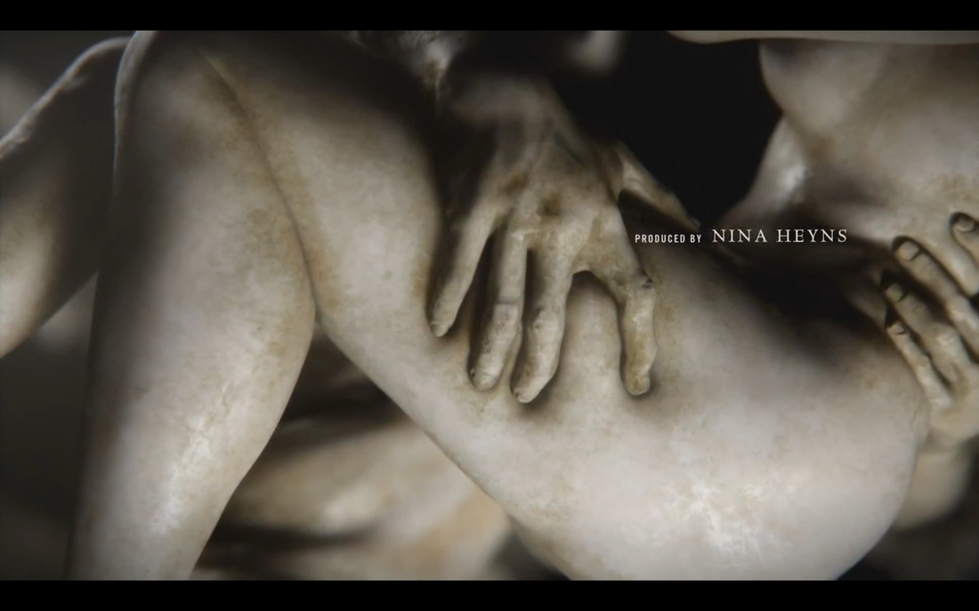
Inspiration for the vignettes was drawn from carvings and artwork of the time (17-1800's) including scrimshaw, ship carvings and sarcophagi of Paris and Italy. Baroque architecture playing a huge part too.
The font for the titles appears to be Celestia Antiqua. Designed by Mark van Bronkhorst, it is a strong, rough font which does its job without detracting from the main feature. All this is accompanied by a sea shanty inspired score by Bear McCreary. Bear wanted the feel of the music to be raw & gritty like the show, as if performed "on deck of a ship by weary musicians on broken instruments". Mission accomplished! The first sound we hear is that of the Hurdy Gurdy, a stringed instrument of the period that produces sound by a 'crank-turned, rosined wheel rubbing against the strings'.(Thanks google) Other instruments which add to the sound of hell and high water are guitars, fiddles, bodhrán and bones, and of course a motley crew of vocalists. All in all, a highly effective and beautiful piece of design. Elaborate and emotionally charged with each component contributing to the dark and light of the Bronze vs Ivory battle between life and death. 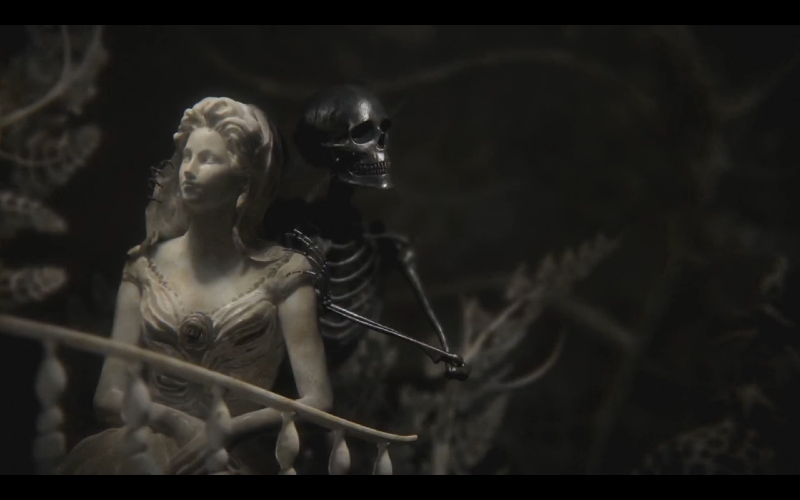
• This article was originally written as a guest post for the lovely folk at Grafik Jager in March 2015. |