City Lit Adult Education Brochure
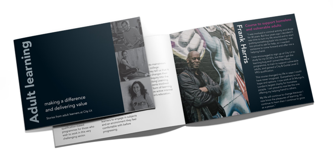
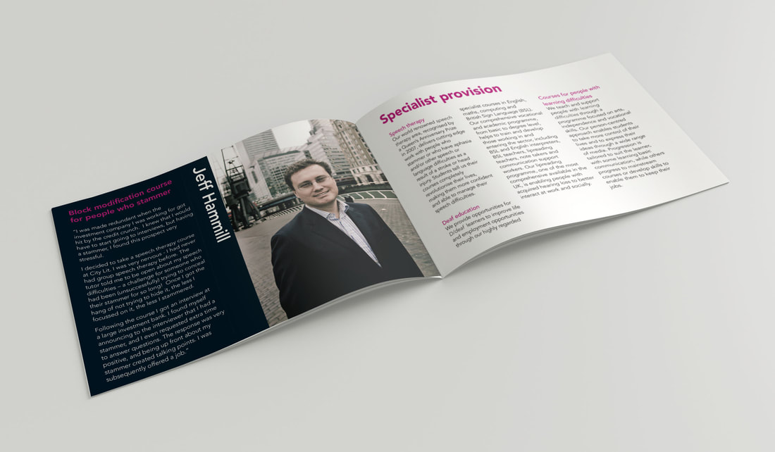
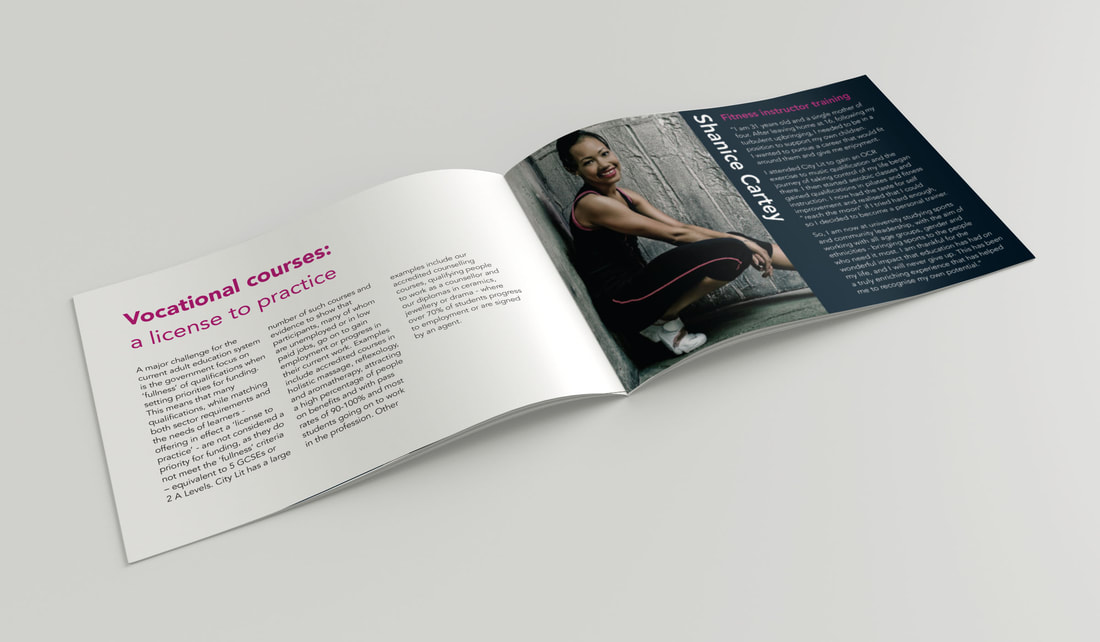
This brochure aimed to tell people about the college from the students’ point of view.
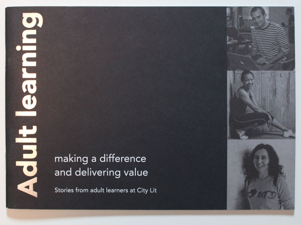
They wanted it to be more striking than their usual style, but remaining identifiable as a City Lit brochure. This was achieved by keeping the house font (Avenir) but making the colours & finishing bolder.
Silver duotone images and a silver foil title on the cover were employed, and although a coated stock would have shown these elements off best, the brand guidelines won out and an uncoated paper was used throughout.